


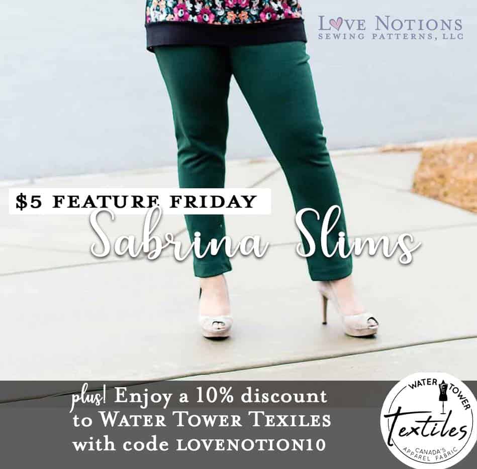
Today, Sneha shows how to mix prints like a stylist! It’s one thing to find coordinates through trial and error, it’s another to understand the theory behind why certain fabrics, prints, and styles mesh together. Get the scoop (and a visualization of a jam-packed wardrobe in only three patterns!) in this post. Plus, along with her super-styling tips, Sneha features one of our most downloaded and loved patterns ever: the Sabrina Slims! For today’s Feature Friday, get the Sabrina Slims for just $5! This is an incredible value for what will become your most favorite, most used, and most flattering pants pattern EVER.
HOW TO MIX PRINTS LIKE A STYLIST
Hello, again! I’m Sneha Nirody Monga of sewingcurves.com, a voracious sewist and pattern tester. I have been testing 1-2 patterns a week (for various designers) for over five years now, with brief lulls when life happened. I have more clothes than space in my closet, most of which are me-made. While that may sound exciting, over time this giant body of work has become overwhelming. I found myself creating pieces that would photograph well since that’s paramount as a tester, but I found it hard to make a cohesive collection that would easily mix and match in real life. That’s why I sat down to create a capsule of sorts, to fill some gaps in styling and purpose – part of my sewing with purpose initiative.
Sewing with Purpose
In my previous post I talked about sewing with a plan, and knowing how fabric will behave before you cut into it. Today let’s take what you already have and push the boundaries of conventional styling wisdom so that you get more out of your hard work. Let’s talk about New Neutrals and how to easily combine prints. We’ll also discuss volume of print and color. Are you ready to dive in?
All the fabrics I’ve used are from Water Tower Textiles, a wonderful Canadian company that has a huge variety of fabrics and bases. They are generously offering all Love Notion’s customers 10% off from August 16th-23rd! Just use the code “Lovenotion10” at check out.
This week’s $5 Feature Friday pattern is the Sabrina Slims, which is a brilliant pattern for pants. I’ve made three of them for this article, and you’ll see how versatile they can be. There’s even a maternity option in the pattern!
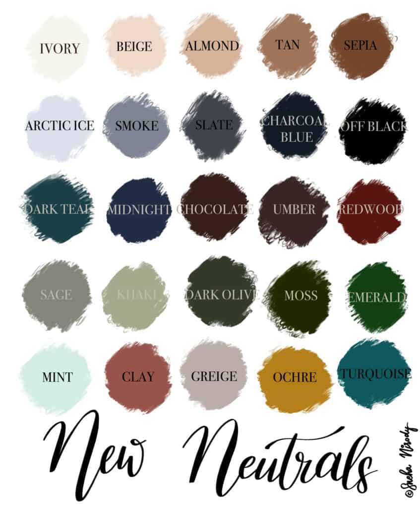
NEW NEUTRALS
Did you know that black, white and navy are NOT your only options for neutrals? Neutral means without color – classically white, black, ivory, taupe, grey and beige. Over time navy, camel, chocolate, khaki, olive and many more colors that are muted and serious have been included in the list. Think about tailored pieces and bottom-wear in these colors, and how they would ‘ground’ your look by giving the eye a resting place. These colors also go very well with each other. So the burgundy pants you thought wouldn’t go with anything else are now a staple!
VOLUME
 Volume is basically how much. Low volume prints like pinstripes, tiny dots, checks and herringbone weave can easily pass for a solid from a distance, and go great when paired with high volume prints with lots of colors and visual interest. For example, on the left, I’ve paired my Forte top in tiny white dots on black with a high volume print skirt. Since the top basically reads as grey from a general viewing distance it looks like a solid. Up close, the black and white are still neutral enough to not jar the eye. It’s also a good idea to feature a high volume top under a neutral blazer or cardigan, reducing the impact of the print. If you’re hesitant to wear prints at all, this strategy is a good way to make a start.
Often textiles are designed in collections, comprising of a main “Hero” pattern which is attention-grabbing and intricate. Then follow the coordinates that are low volume prints that use the same colors as you find in the Hero print. Coordinates usually use two or three colors and make wonderful garments with great versatility.
COMBINING PRINTS in a CAPSULE WARDROBE
You don’t have to always have a solid paired with a print – two prints can easily work together — as long as there is a difference in volume. Here’s a look at my four Forte tops, three Ravinia skirts, and three Sabrina Slim pants.
Navy Sabrina Slims
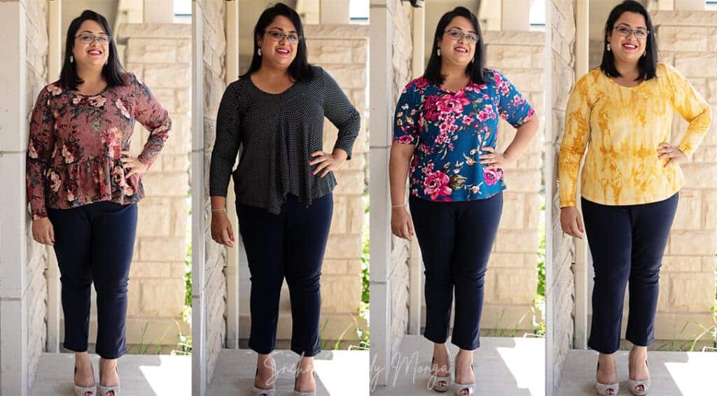
Everyone needs a navy pull-on pant like the Sabrina Slims. Not as severe as black, navy is elegant and works with literally any color and print. There’s a slight fit issue that I discussed in my last post with these pants, which has since been fixed after I took these photos. They’re now my #1 pair! Notice that I tend to keep my tops from being too long, so that the bright print doesn’t overwhelm my body.
Charcoal Sabrina Slims
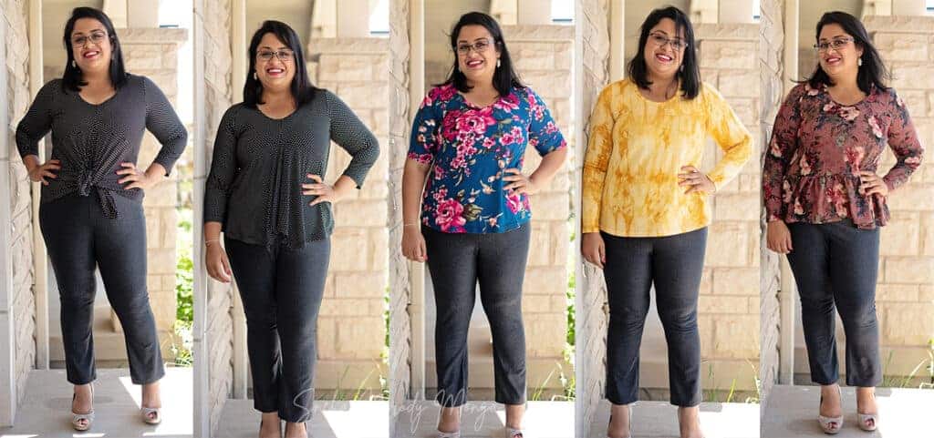
Who knew the Forte View B – the waterfall style – could be tied in front as a knot top? What a transformation! It also emphasizes my waist (I’m a very rectangle/apple shape) giving me curves through the torso. You can play with knots and tucks to modernize your look without sewing a thing.
From a distance the charcoal herringbone pants read as a solid. Both the color and texture complement the brightness of the printed tops. It’s a solid without being boring.
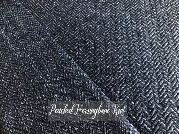
Cable-knit Sabrina Slims
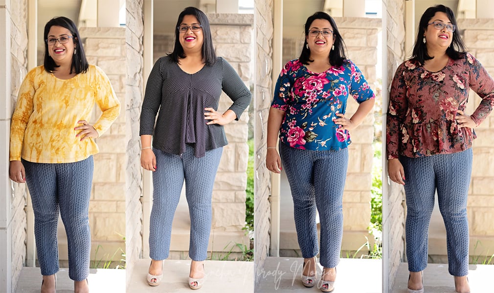
These Cable-knit blue jacquard pants are thick, comfortable and versatile. I’m planning to wear them in the winter for that classic cold weather style. The color is muted and helps the tops shine, while the texture of the pants is reminiscent of hand-knit sweaters and chilly days.
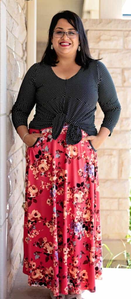
Floral Ravinia
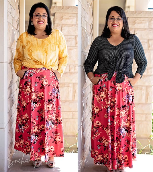
Here lies the pitfall of being a floral aficionado – it’s hard to put two equally busy prints together. While it can be done, and we see them often on the fashion runway, it’s quite overwhelming for daily life. These two Forte tops were the only two that would pair well with this gorgeous Ravinia skirt.
Teal Ravinia
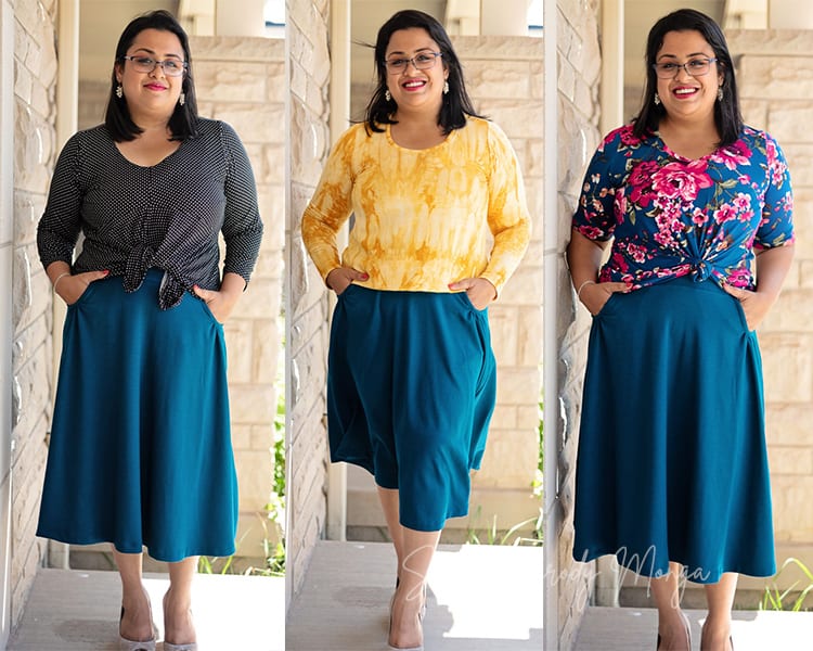
This Ravinia is probably my favorite of this collection. Dark teal is the perfect New Neutral in my opinion, easy pair with practically any top – it goes great with ivory, mint, clay, sepia. There’s also enough strength of tone (it’s quite saturated) to pair with black or white without looking overpowered.
The mauve sweater-knit Forte with the ruffle hem has too much volume right at the hip to pair with an A-line skirt. I would basically look like a rectangle. While I could use a belt over the top to cinch the waist in, I don’t own one, sadly. Maybe a belt should be my next project?
Striped Ravinia
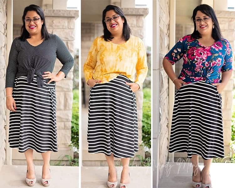
I love stripes for bottomwear, especially skirts. Recent trends marry florals and stripes in such lovely ways, as seen in textiles, planners, stationery and even wall art. You don’t need to pick such a high contrast stripe, a subtle tone-on-tone stripe can work well too. I recognise that I tend to make high-contrast color choices, but even muted colors can shine when the proportions are right.
I’ve added a knot, a half-tuck and the rubber band trick to shorten the length of the top in the above photo. If the top were too long the proportions of the body would be thrown off. My legs look longer and I look taller when the ratio of the top to the bottom is 1:2. Try this trick for a quick knot – gather the extra fabric of the top into a bunch, and tie it with a hair elastic or rubber band. Tuck this under the hem and you’re done!
Sewing with Purpose, and STYLE!
I hope these tips help you, and that you too can find new ways to combine your favorite pieces by making new combinations. Don’t forget to grab your Sabrina Slims for just $5 today, and check out Water Tower Textiles for their incredible fabrics and your Love Notions discount!

